Gyoren no Sakanaya
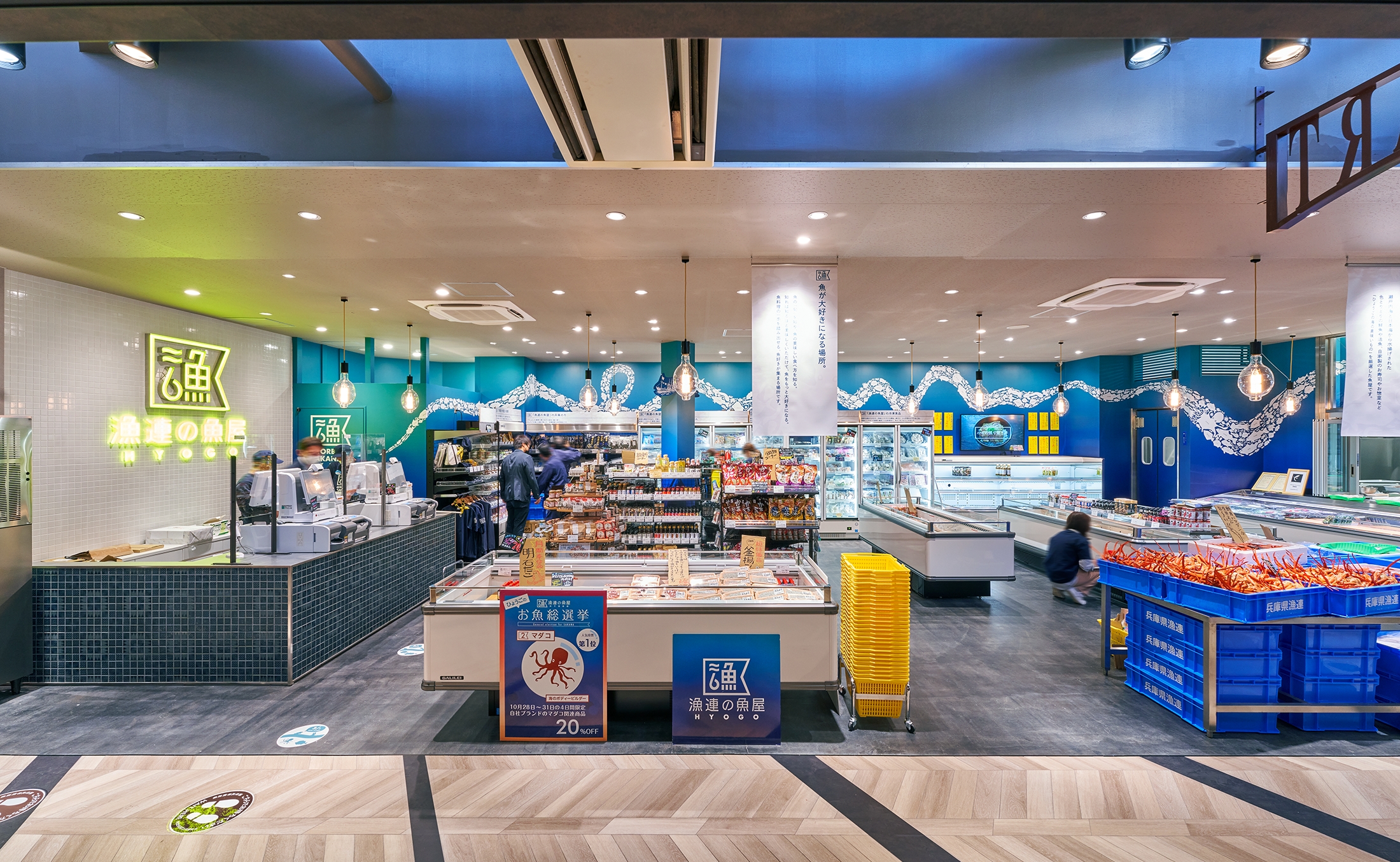
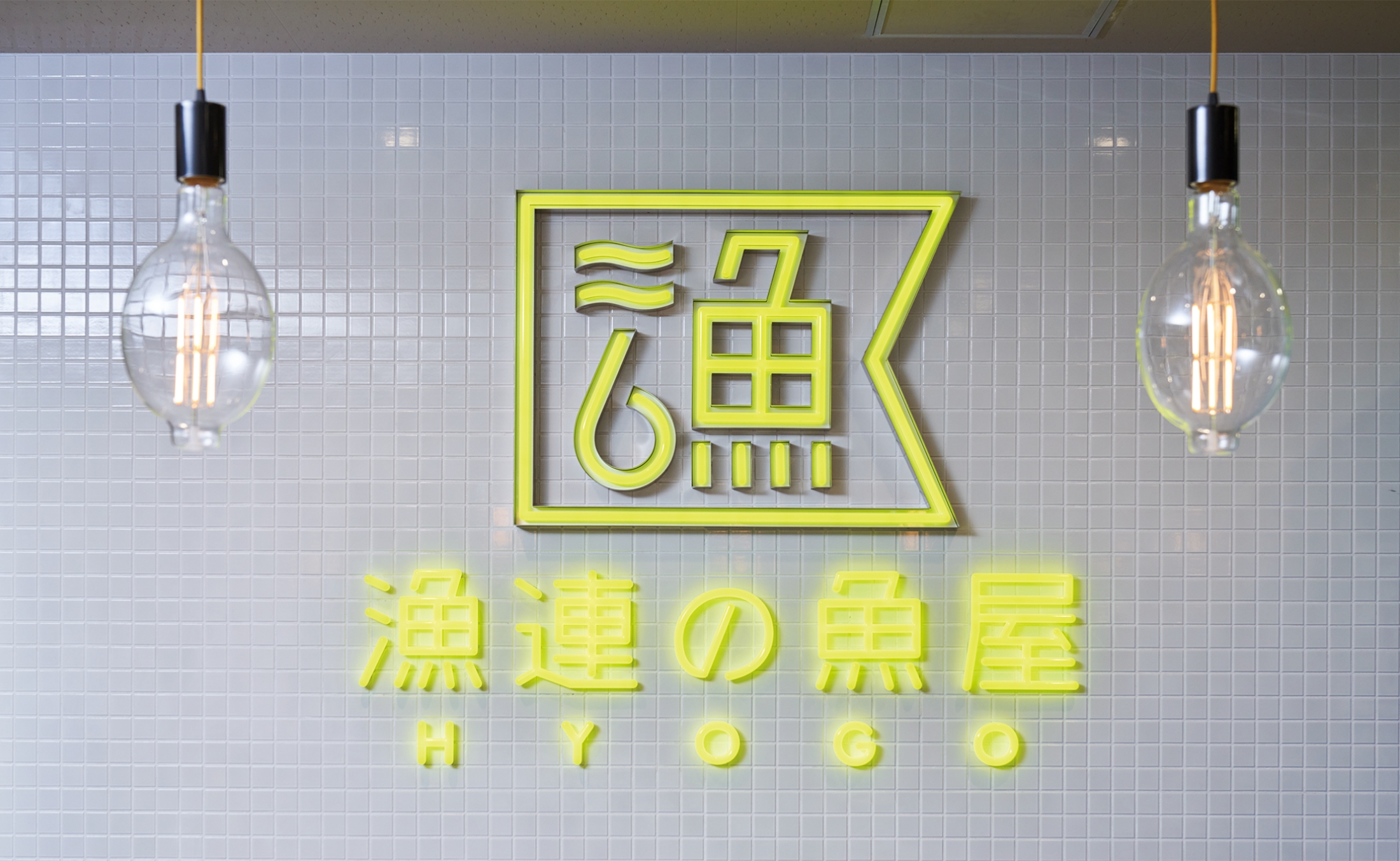
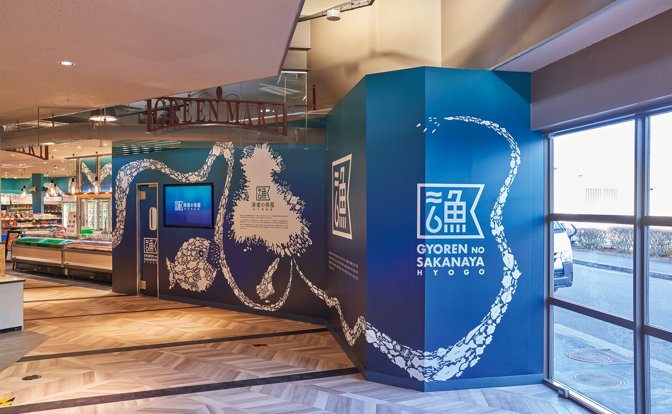
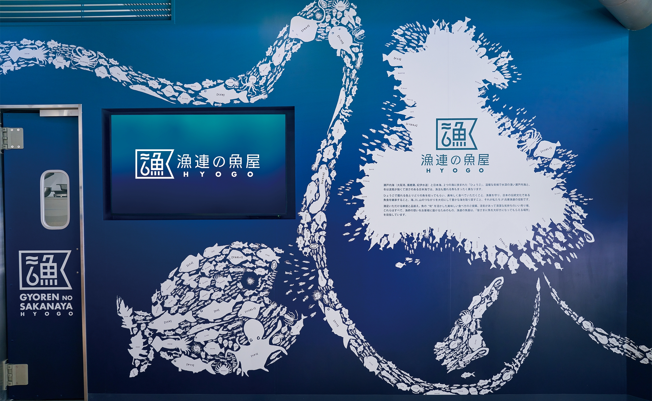
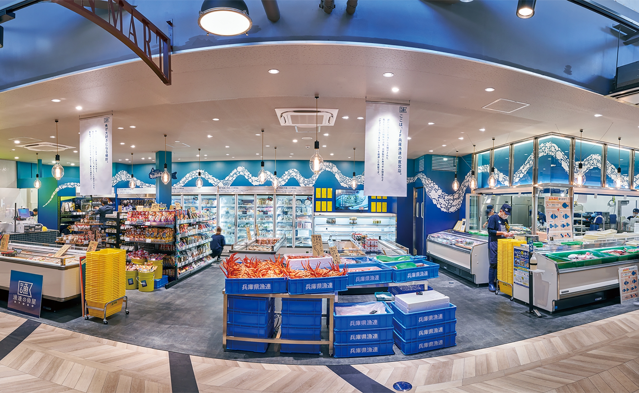
We had the opportunity to manage the branding of “Gyoren no Sakanaya”, a fish store operated by Japan Fisheries Co-operative (JF) in Hyogo. We chose deep blue as the signature color of the shop’s interior to express the sea of Hyogo and its abundant marine life. The walls are also teeming with illustrations of fish from the nearby waters. We also oversaw the creation of videos to improve viewers’ knowledge about fish in the sea. In line with the branding concept, we have produced a place where people can have fun getting to know about fisheries and local fish.
-
 Art Direction
 -
 Branding
 -
 Graphic Design
 -
Illustration・Animation Design
-
Photo/Video Shooting and Arrangement
-
 Structuring・Editing
Note
“People usually associate fishmarkets with vigorous fishermen, Tairyo-bata (fishing boat flags hoisted to indicate a big catch), and fishmongers boasting to customers about the freshness of their product. However, when it comes to the “Gyoren no Sakanaya” fish store, which is operated by Japan Fisheries Co-operative in Hyogo, in addition to selling freshly-caught fish, it also has a mission to facilitate people’s understanding about fisheries and the importance of eating fish. The shop has a clear concept of being a place where people can have fun getting to know about fisheries and local fish. The branding concept also intended to help people experience and become familiar with sea life. We selected deep blue for the base color of the store instead of light or medium blue commonly used at fish stores, because deep blue is the color of waters where fish are caught the most. A bit of vivid yellow adds some accent to complement the deep blue. Hyogo has the Japan Sea on the northern side and the Seto Inland Sea, part of the Pacific Ocean, on the southern side, and therefore a huge variety of fish are caught from the nearby seas. In order to let people know about this fact, I have designed illustrations of all kinds of fish caught from the neighboring seas, and decorated the deep-blue wall with the white illustrations of marine life. I also designed various other things including sales promotion tools, their uniform and videos to play on the digital signage, thereby unifying the design as a whole.”